ThinkSCIENCE

At a Glance
Holistic design project involving corporate identity, website design, illustration and print design for ThinkSCIENCE, a company providing expert translation and editing for science.
In Detail
ThinkSCIENCE – Expert translation and editing in science, medicine, technology, and the humanities
Tokyo-based ThinkSCIENCE approached us about a full design overhaul as part of their 10 year anniversary. The project involved design for the following items:
- Logo and corporate identity brush-up
- 10th anniversary logo version
- Website UI/UX design and layout for desktop, tablet and mobile (excluding web development)
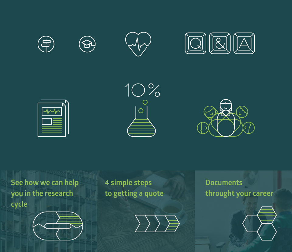
- Icons and chart design
- Newsletter design
- MS Word and Powerpoint templates
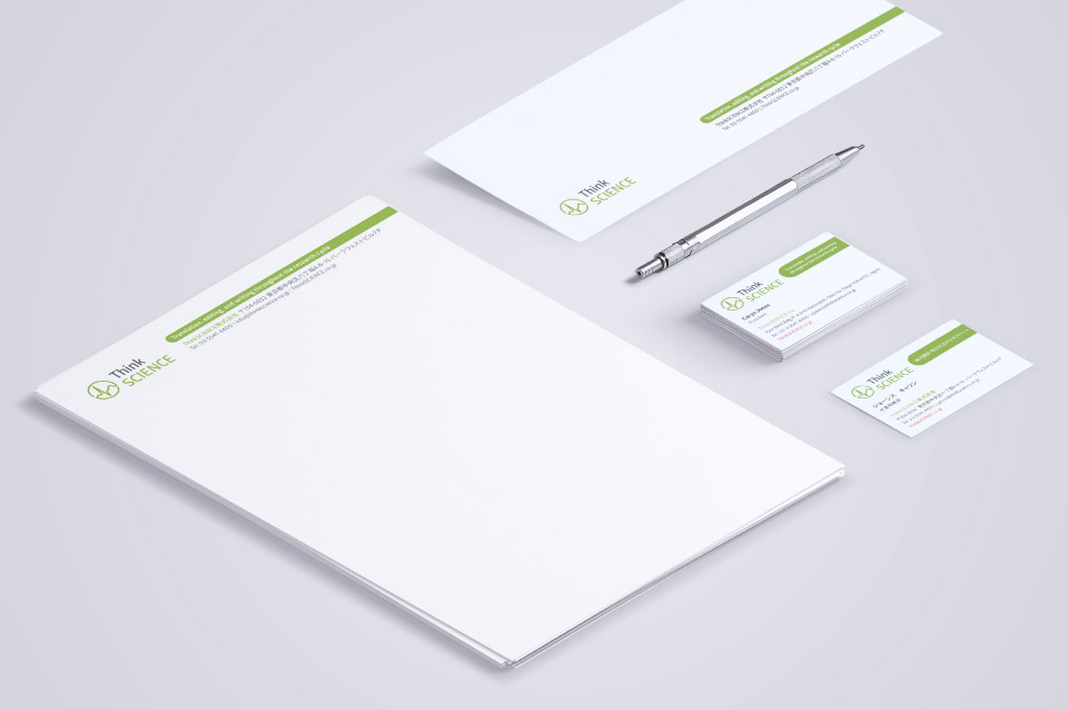
- Print Collateral: Business cards, letterhead, 2x envelopes
- Ad banners for various websites
Corporate Identity & Logo
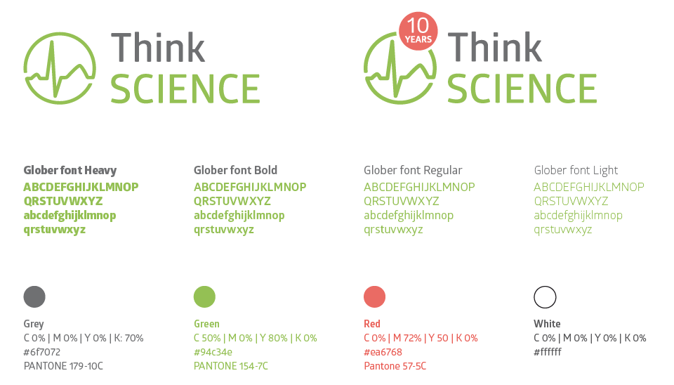
The newly brushed up corporate style of ThinkSCIENCE follows a strict colour palette and the logo was updated to a more circular line-based design. The logo continues to use their science related heart-beat wave to preserve the DNA of their previous identity. Also associated design elements like icons and charts follow the same design style and play with different coloured lines. The newly added corporate font Glober is inspired by classic grotesque typefaces but has it’s own unique style with softened geometric forms.
Iconography
Print Collateral
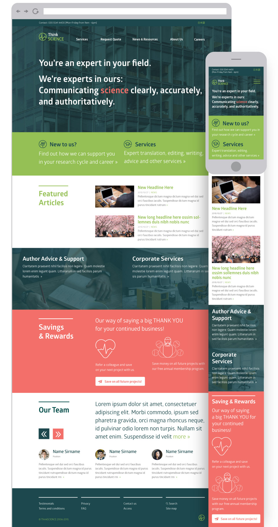
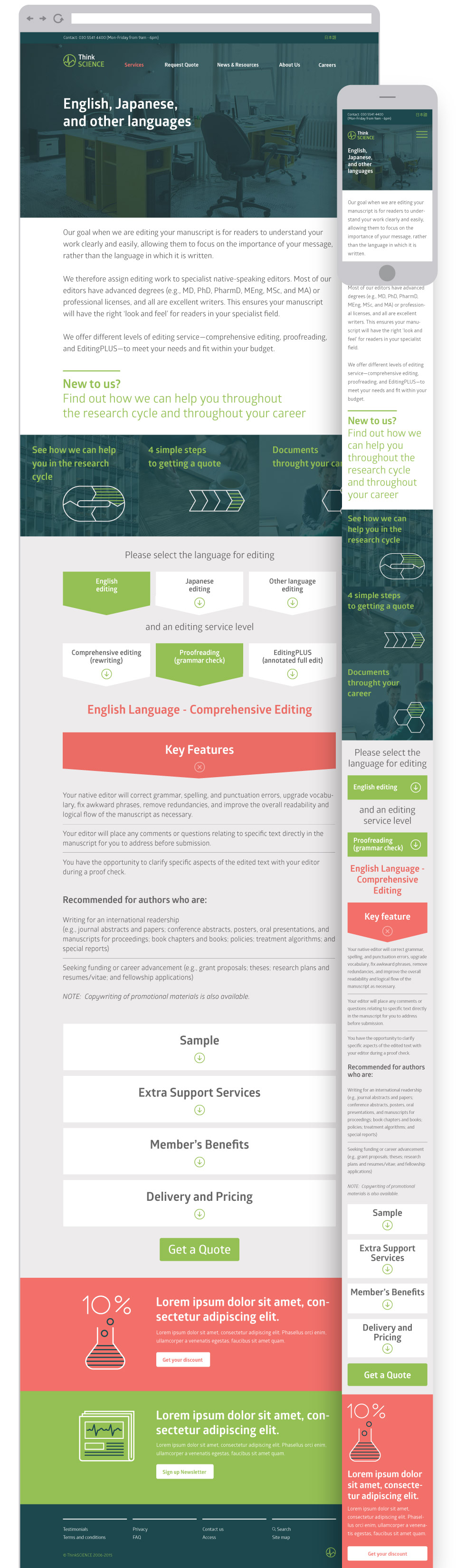
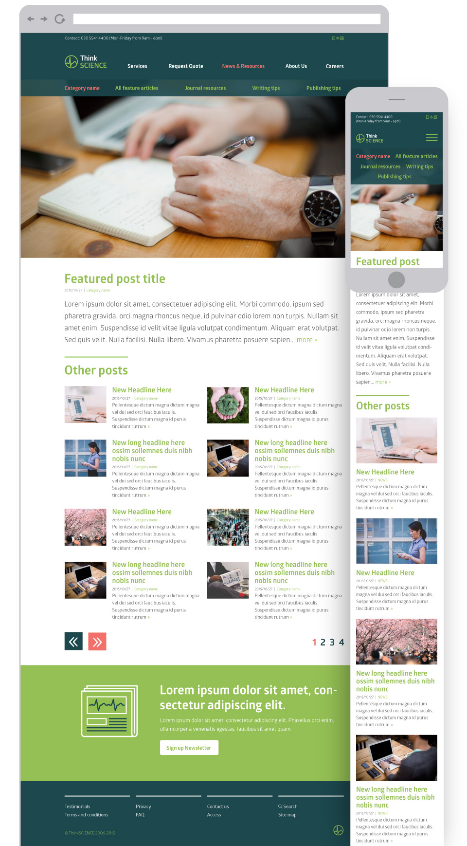
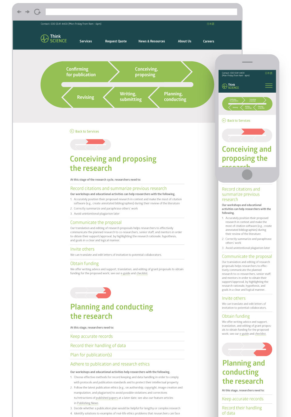
Website Interface Design
The website design process started with basic wireframes and involved mapping out multiple interactive pages which needed to work in a responsive mobile-friendly environment. The varied grid-based website design is broken up with bold coloured sections, supported by many engaging icons and fresh photo imagery. Some pages feature complex interactive elements, such as the quote forms, or explanatory service pages like the Research Cycle and Career Support.