Solis Lab
At a Glance
Corporate identity design for web development agency Solis Lab.
In Detail
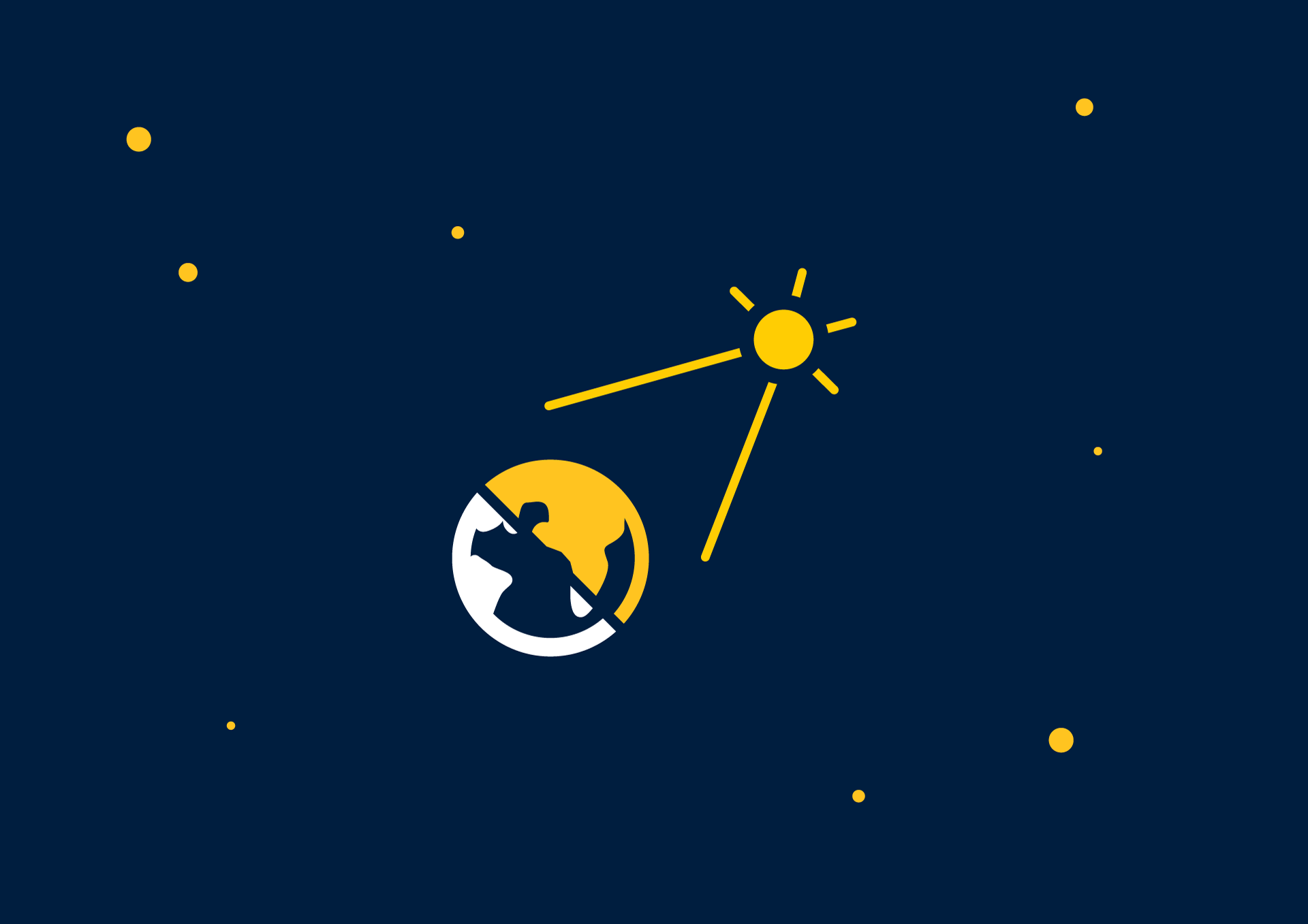
Solis is a Spanish name derived from the Latin sol solis, literally meaning sun. Based on this notion our design concept started with ideas revolving around sun, planets and space. Solis Lab – as a web development agency – is the central sun or hub. In its orbit are multiple planets which represent their clients. With ongoing development support Solis Lab enables these clients to achieve more than they otherwise would.
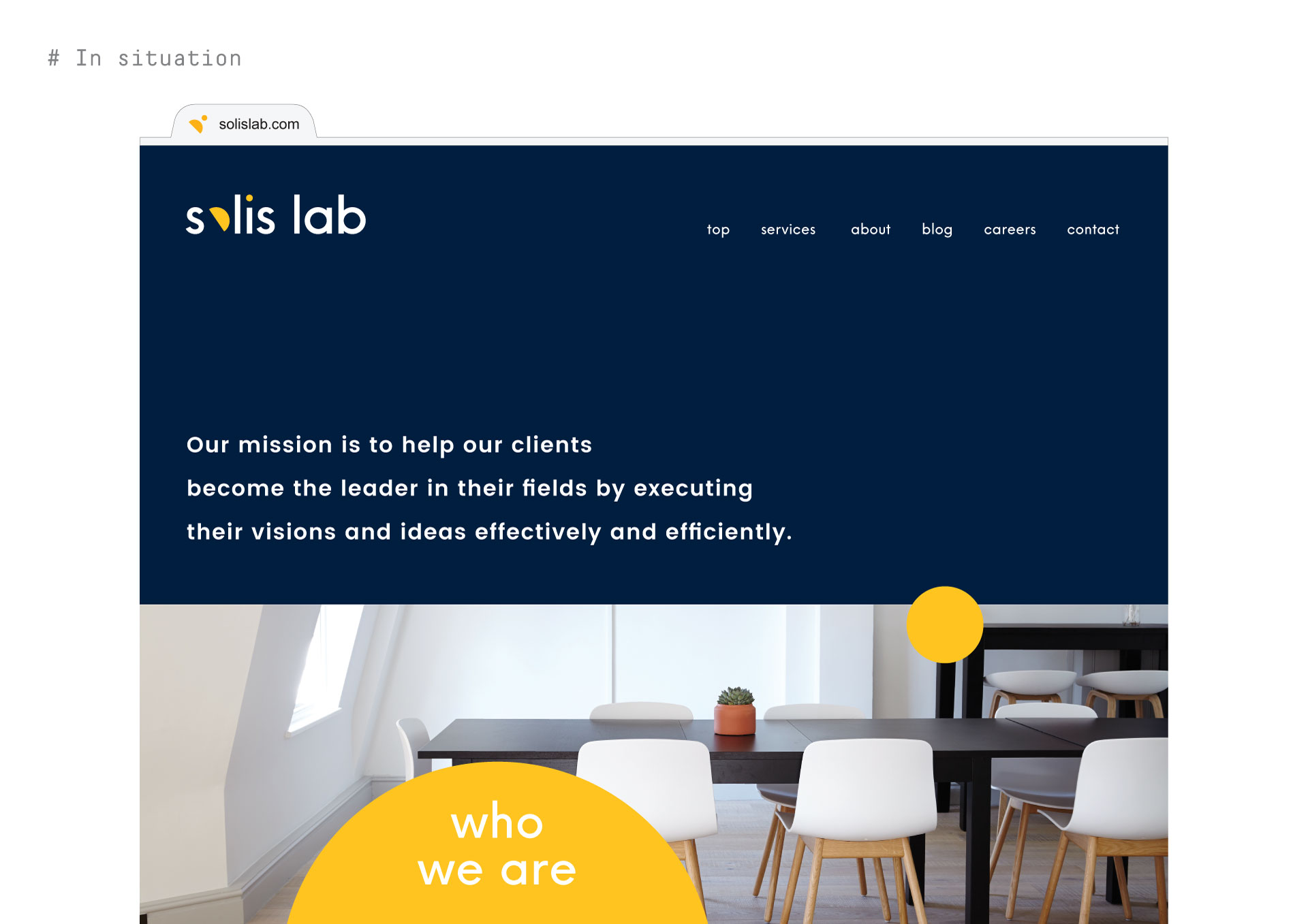
Our mission is to help our clients become the leader in their fields by executing their visions and ideas effectively and efficiently – Solis Lab
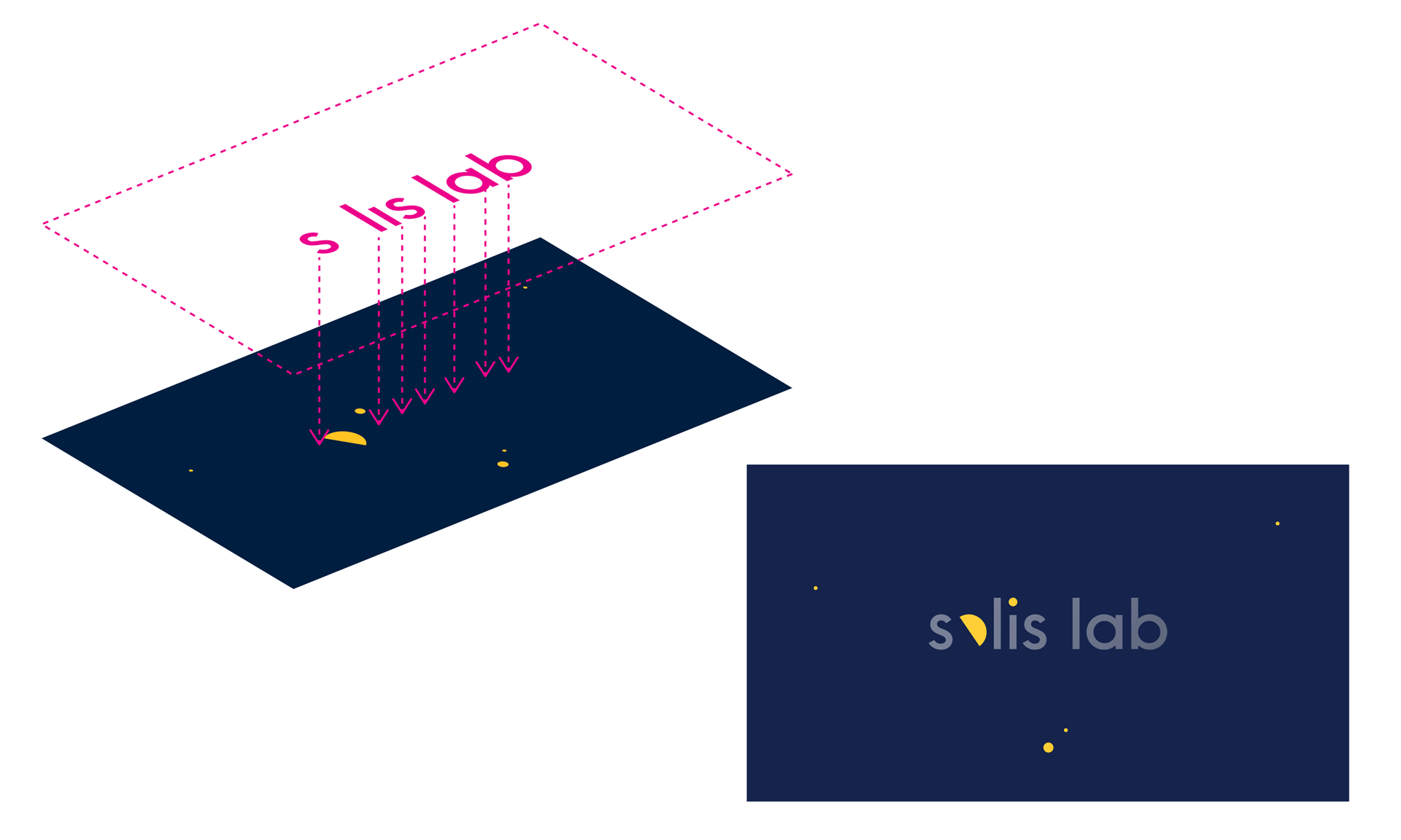
Derived from this concept the sun/shadow idea was born – the bright and the dark side of a planet – which we introduced to the logotype.
Logo & Corporate Identity
To our advantage, the constellation of a planet orbiting a sun could be found in perfect relation in the typography of the Solis lettering. This resulted in a logotype – a typographic logo. Also a matching logomark icon version was derived.
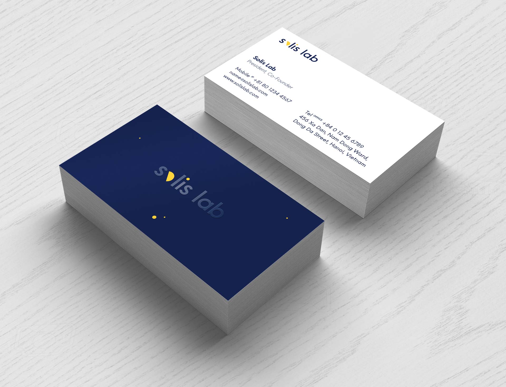
Business Cards & Letterhead
The backside of the business card features a Solis Lab logo which was printed with clear varnish, adding a shimmering and special feel. The dark blue background and yellow planets are printed in regular 4C color.
Web Direction & Animation
As preparation for the upcoming website relaunch we provided vital art direction and design review during the web design phase. We also made concepts for various animations e.g. animated logo, loading spinners or a larger header animation for the homepage.