The Japan Times
At A Glance
Fully responsive state-of-the-art custom website re-design for The Japan Times, Japan’s oldest and most widely read English-language newspaper.
What we did
Information Architecture, UI, UX, Responsive Web Design, Front-end development, SEO Optimization, Custom Plugin Development, CMS Implementation.
In Detail
Emphasis on user experience coupled with working closely together with The Japan Times, allowed us to redesign Japan’s largest English news website into an enjoyable experience so that readers could focus on what mattered most, the content.
We were tasked with completely redesigning the website and user experience for The Japan Times. With millions of users each month, The Japan Times needed a site that could do the following:
- Allow the best possible reading experience for its users across all devices
- Offer intuitive navigation and content parity
- Open the media company’s content up to a larger number of readers
- Showcases its high-quality news and features in an easy-to-read format
- Feature crisp typography and high-resolution photos
Open Collaboration and Client Involvement
We worked together with the client, sharing our reasoning behind user experience and design-related decisions. By openly collaborating and involving members from The Japan Times in these key steps, we ensured that we were creating an optimized experience for users that felt familiar, and was intuitive and satisfying at the same time.
Responsive, Mobile First
Considering mobile first, we were able to meet the most basic of user requirements on mobile platforms, and build up from there. This enabled us to design a quick, concise and relevant mobile experience, which carries over to desktop as well.
Redesigned for mobility and the future
Following its release, the new Japan Times site saw a large increase in readership and traffic. It also grabbed the attention of international designers and users alike, garnering praise for its sleek, simple design and enjoyable user experience.
For a live preview of the responsive website see this demo page.
The leader in English-language news on Japan takes a step into the future of new media.
The Japan Times, the nation’s oldest and most widely read English-language newspaper, achieved another milestone today with a new radically redesigned website built for mobility and the future.
Utilizing the cutting-edge technology of HTML5 and responsive design, the new website displays pages automatically sized on the fly that can fit the specifications of a multitude of devices, from widescreen TVs to tablet PCs to compact smartphones. No installation of an application is necessary; it all happens by merely accessing www.japantimes.co.jp with a device’s web browser.
– The Japan Times
- Press Release: Into the future of new media
- For some further reactions from across the web also see this launch announcement.
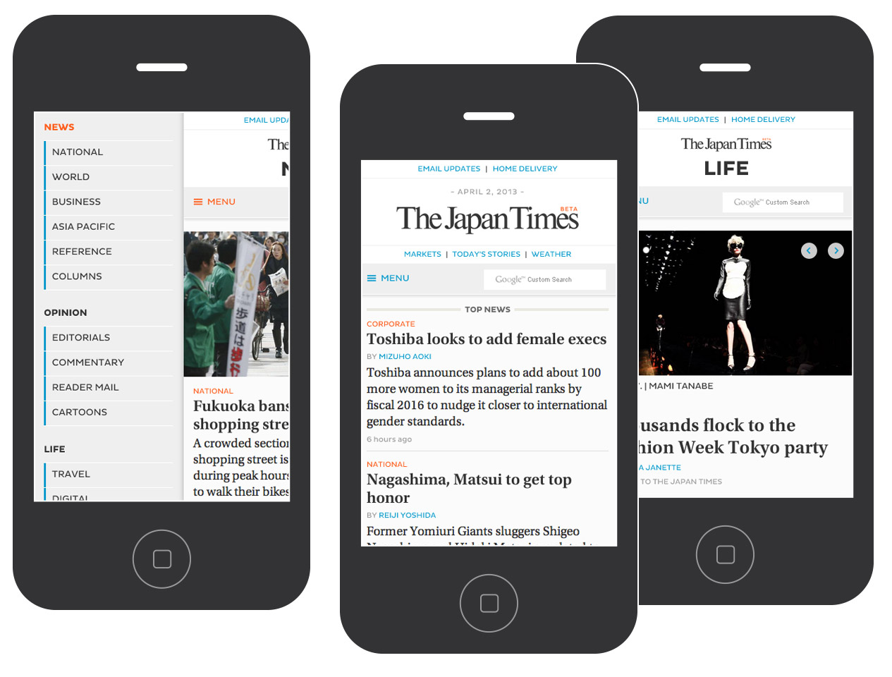
Smartphone & iPhone Layout with Offcanvas Menu
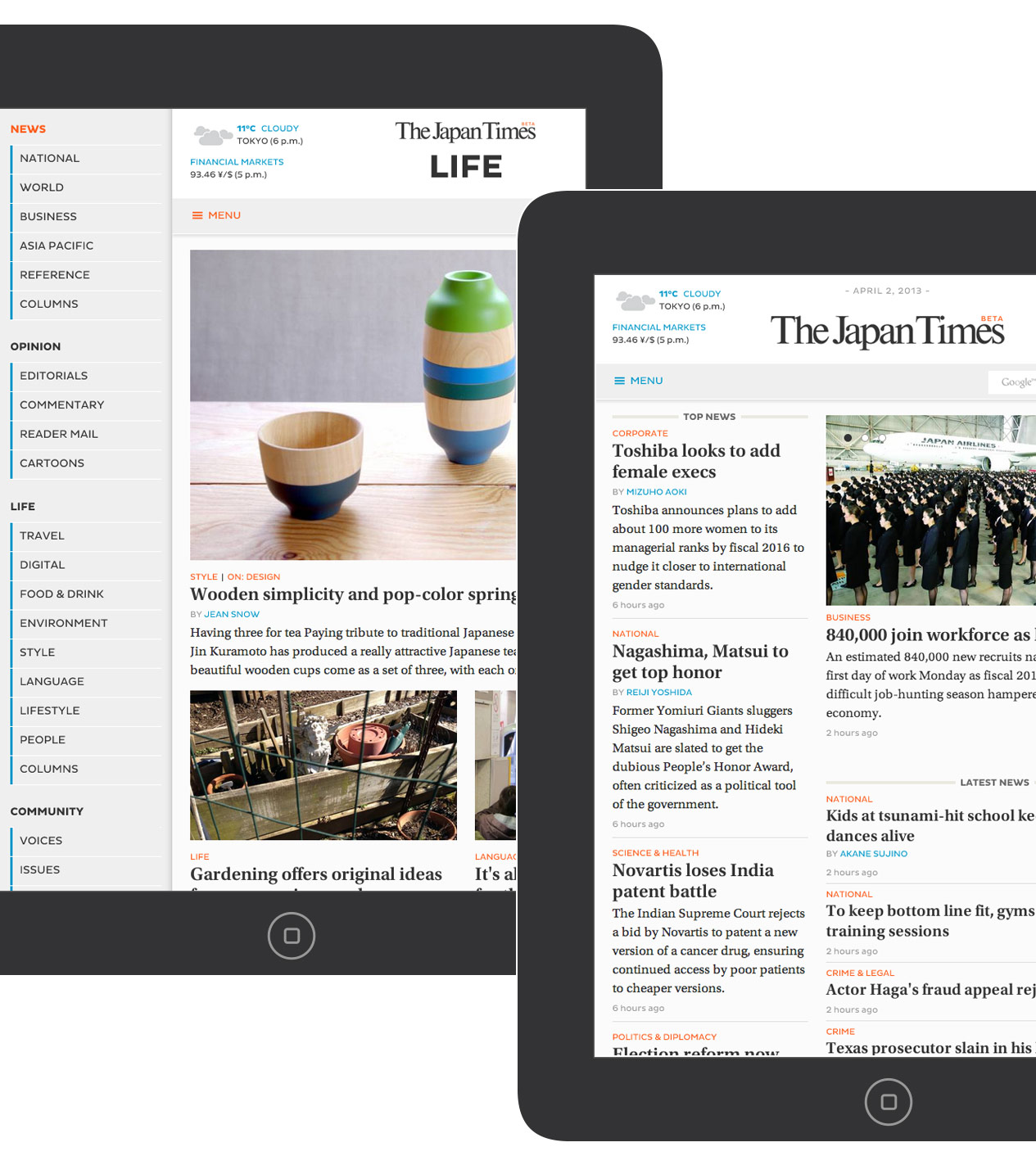
Tablet & iPad Layout
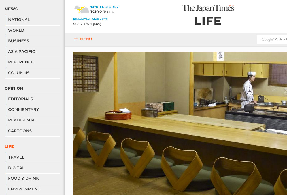
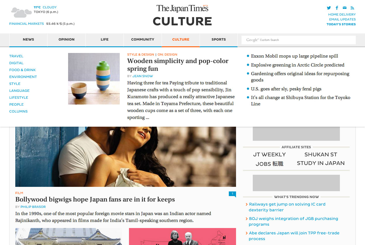
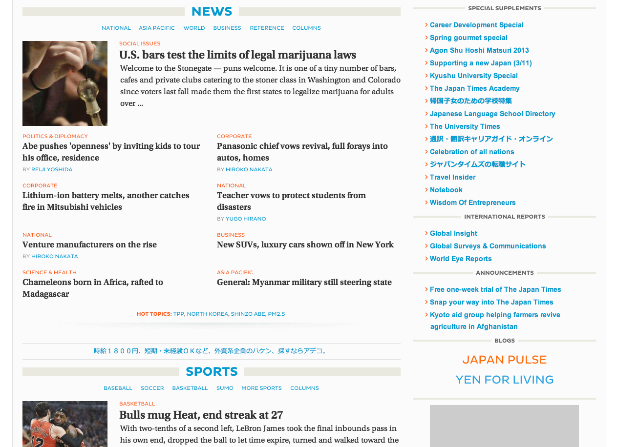
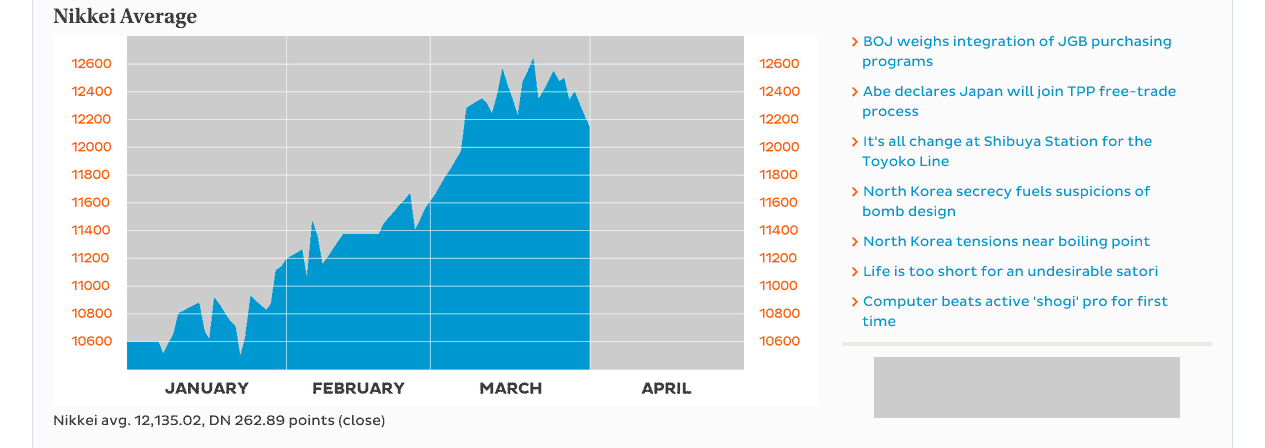
Desktop Layout
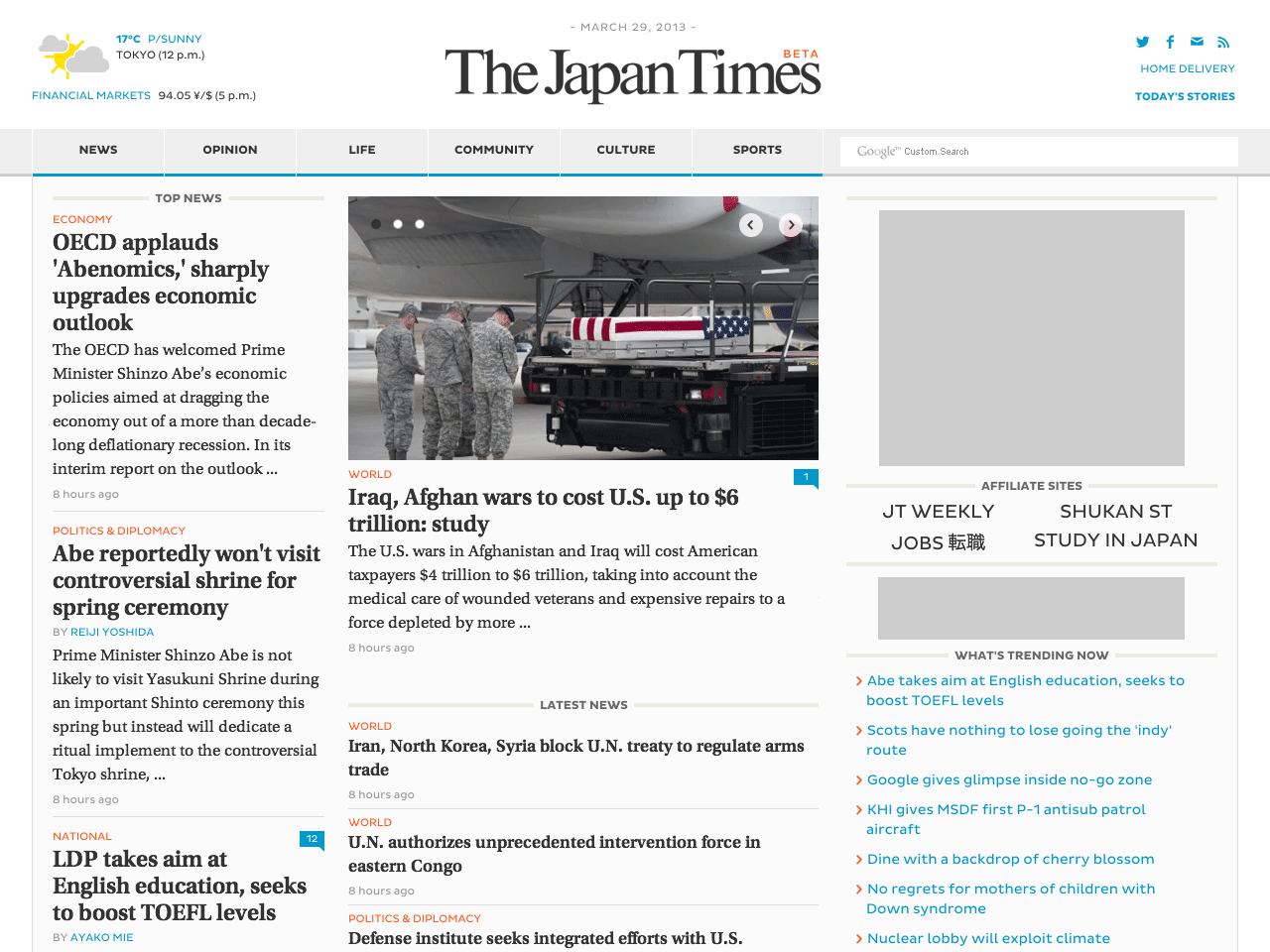
The desktop layout unfolds into three columns on landing pages and expands nicely on large monitor screens. See some of the sample features and layouts of different pages below:
Flyout Menu
Section Modules
Market Page
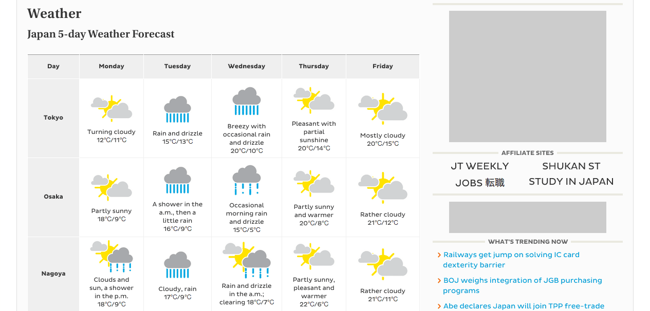
Weather Page
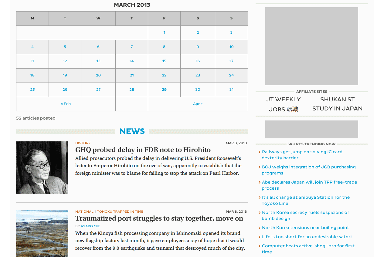
Today’s Stories Page
Large Lightbox Slideshow

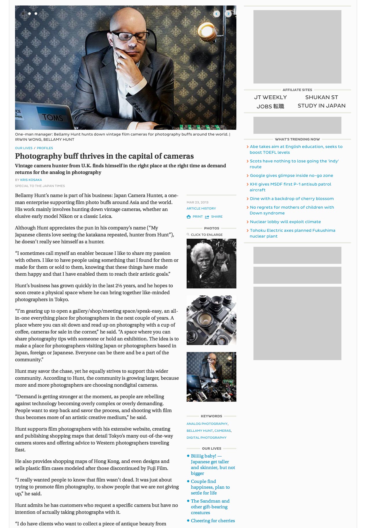
Article Page
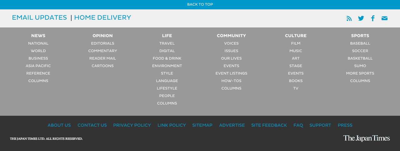
Site Footer
Geek Facts:
- Large scale news website with millions of users each month, based on Wordpress CMS.
- Custom backend integration with Woodwing publishing system via XML-RPC.
- Fully responsive layout to be easily viewed on smartphones, tablets and large desktops.
- Responsive ad loading of differently sized banners based on screen width via Javascript.
- Fully taking advantage of Custom Post Types to structure the site and query featured contents for landing pages.
- Using custom fields (via ACF plugin) to the maximum possible advantage e.g. custom galleries, video embedding, SEO keywords, control article position on page etc.
- LESS was used a CSS preprocessor
- Memcached via W3 Total Cache and hosted on several load-balanced Amazon (AWS) instances and redundant database servers.