Dignified Professional Network
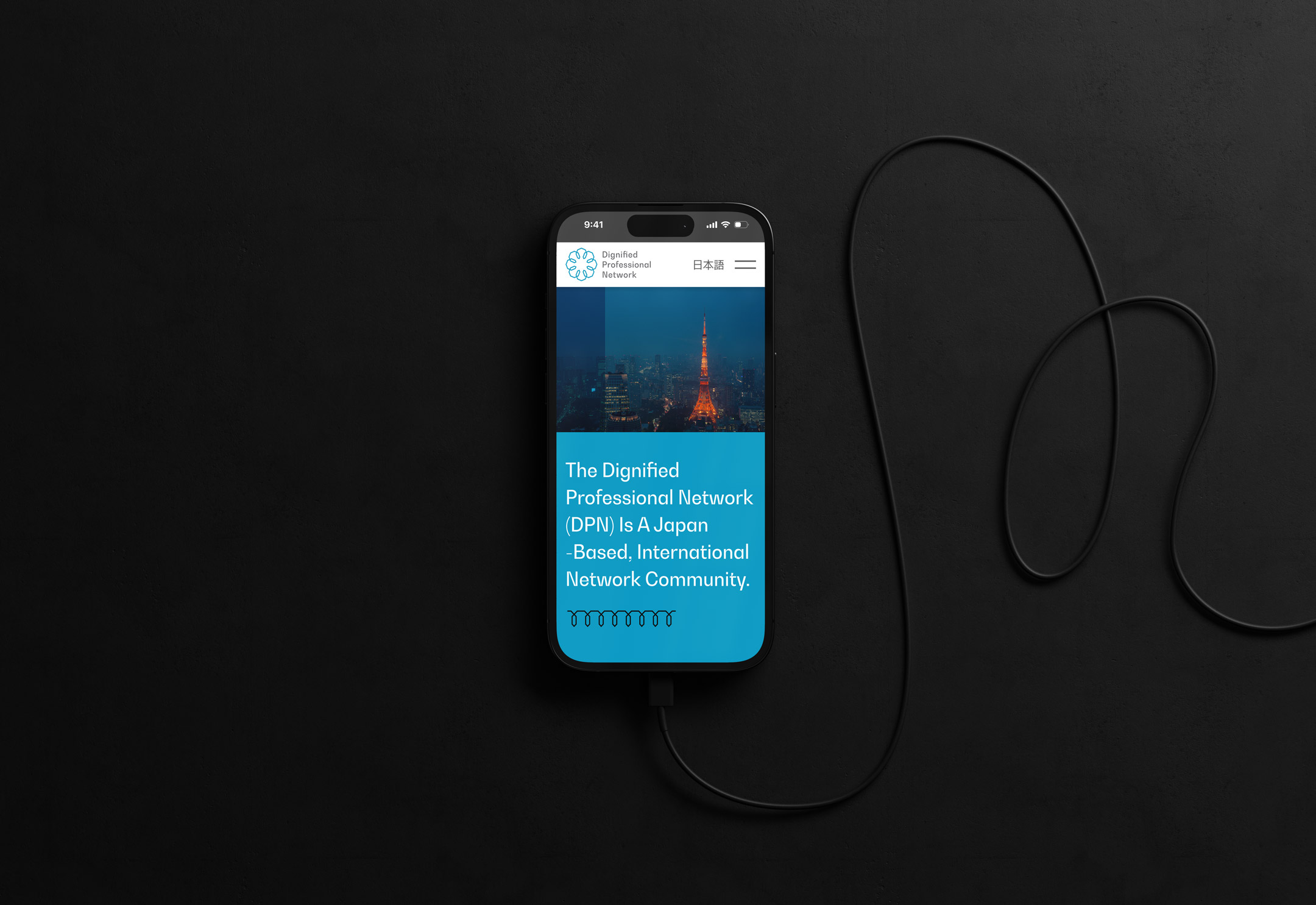
Dignified Professional Network (志士ネットワーク) entrusted us with visual identity development and interface design (UI/UX) of their new membership website.
Client
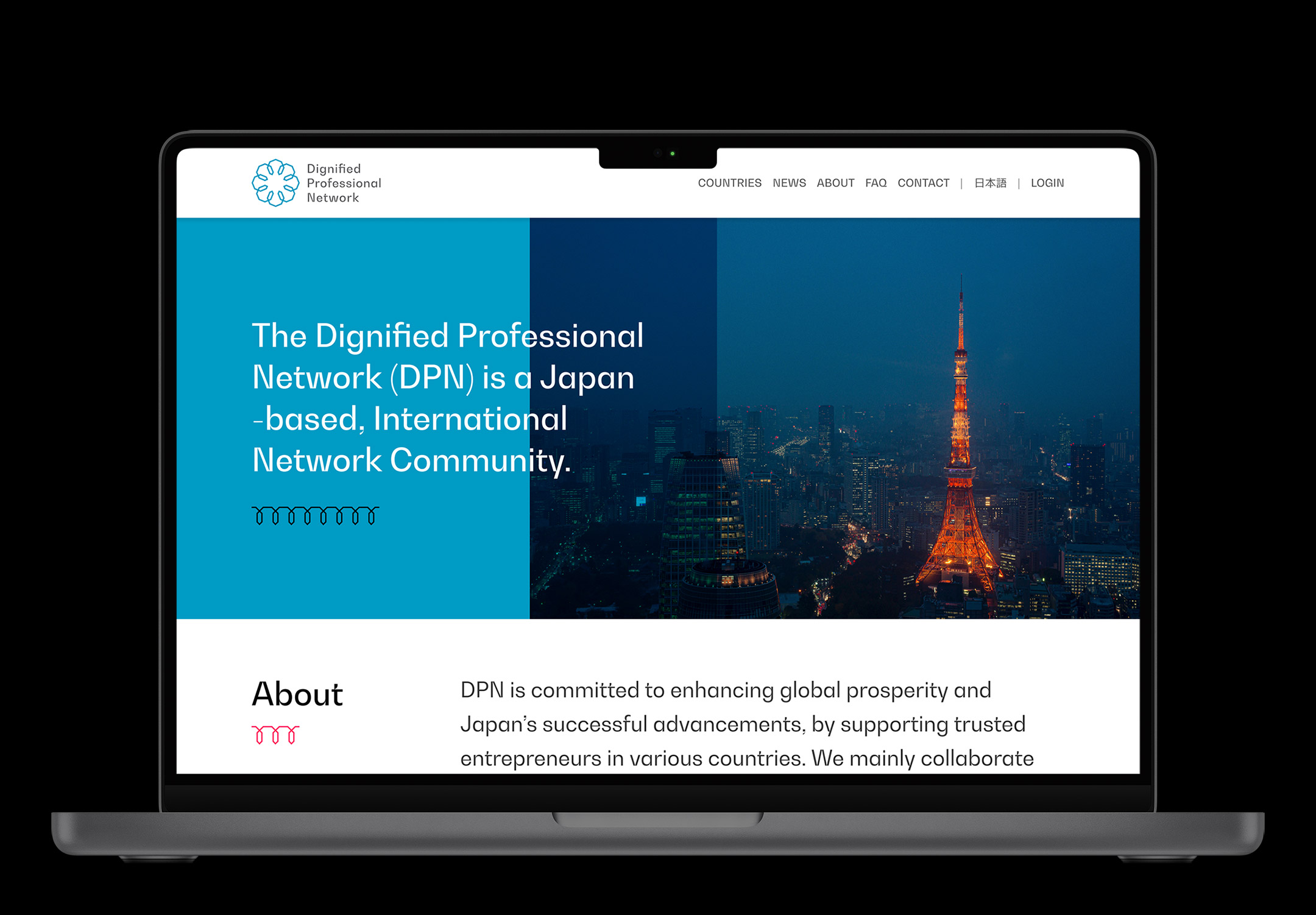
The Dignified Professional Network aka DPN is a new kind of business network based on trusted partners in various countries.
Founded in 2021, DPN is a global network of organizations and individuals committed to business collaboration that also contributes to the common good. The members of the network, known as Shishi (志士), are company representatives, private individuals, and public officials who are selected for their integrity, their expertise in diverse professional realms, and their synergies in contributing to the network’s goals.
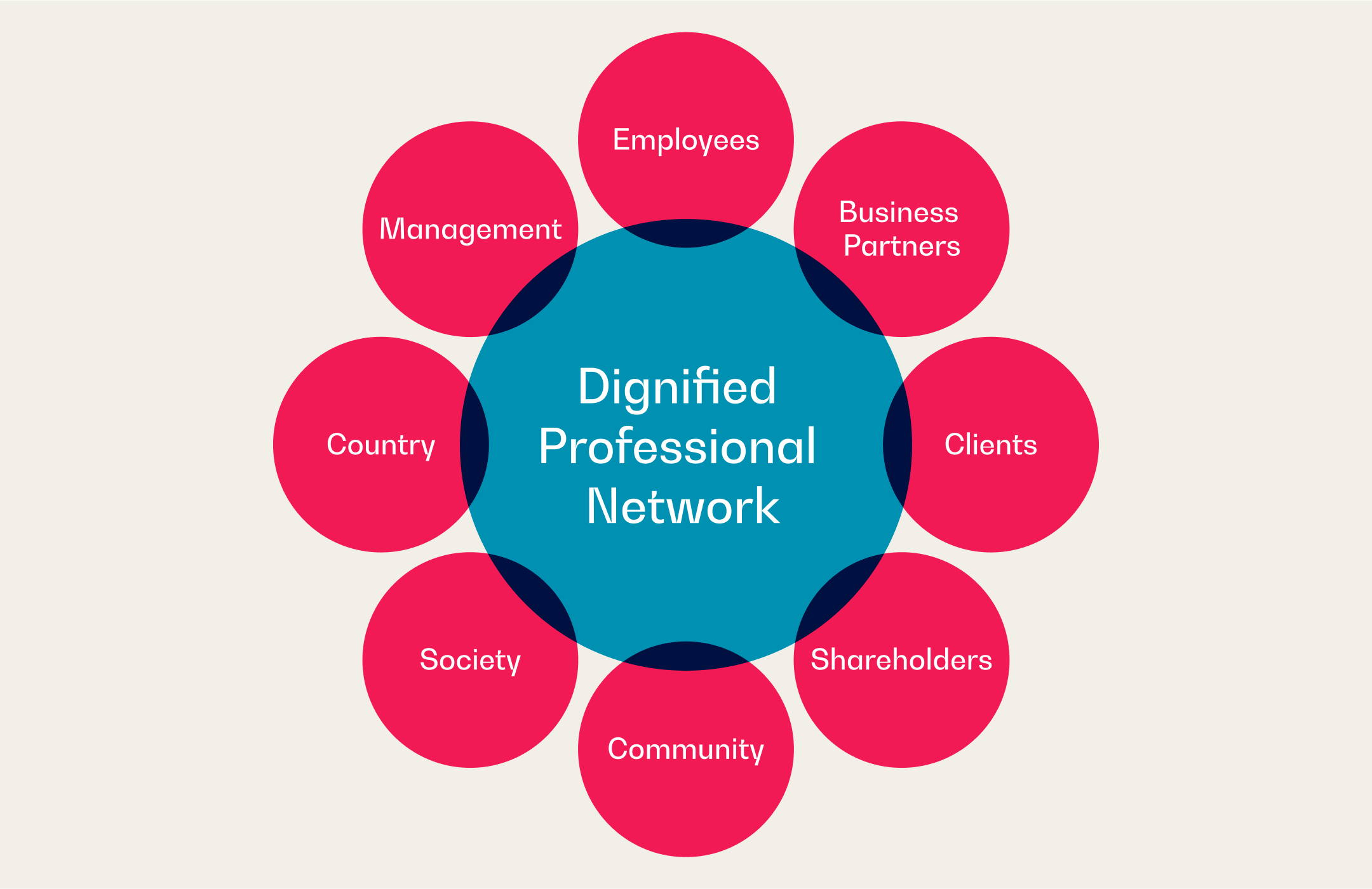
DPN’s founding principle is happo-yoshi (八方良し: literally, “good in eight directions”) for the benefit of all. Derived from sanpo-yoshi (三方良し: ”good in three directions”), a time-honored Japanese approach to business that is “good for the seller, good for the buyer, and good for society.” Happo-yoshi embraces eight stakeholders: customers, business partners, employees, shareholders, management, local communities, the nation, and society. The aim is to serve the interests of everyone involved. In this sense, happo-yoshi works along lines similar to true “win-win” but recognizes a much broader set of stakeholders.
The Works
DPN approached Bento Graphics as Tokyo based graphic design, web design and web development studio. The main goals of their project was the design and development of a visual identity and website interface design (UI/UX) for their new business network.
Visual Identity Design
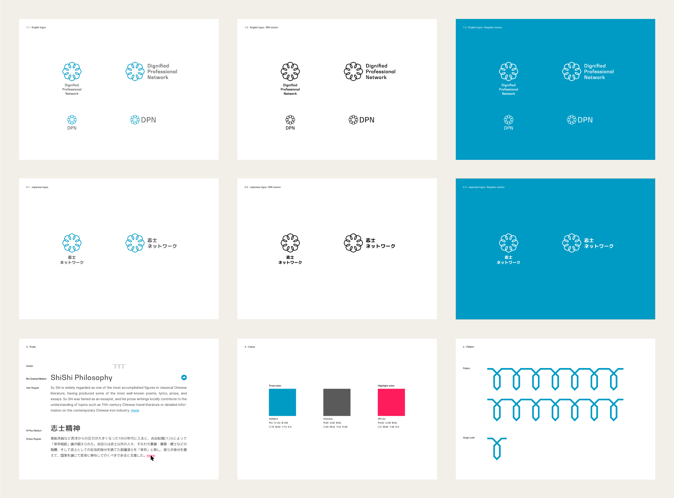
In the first part we developed the visual identity based on DPN’s unique “happo-yoshi” business approach. In their philosophy 8 stakeholders are vital to the successful business liaisons they facilitate.
Based on this we submitted 4 initial logo and branding directions. The winning logo draft features a hexagonal outline which represents the 8 stakeholders. It evokes an image of interpersonal connections of members, as well as the appearance of a Sakura flower, an iconic Japanese symbol. Additionally a branding pattern was derived from the logo which represents continues collaboration with its looping shape.
The color palette and font selection support the overall visual identity with a fresh and modern appearance suitable for a contemporary business network.
The final deliverable is a visual identity guideline with English and Japanese logo versions in various arrangements, color palette, font selection and branding patterns.
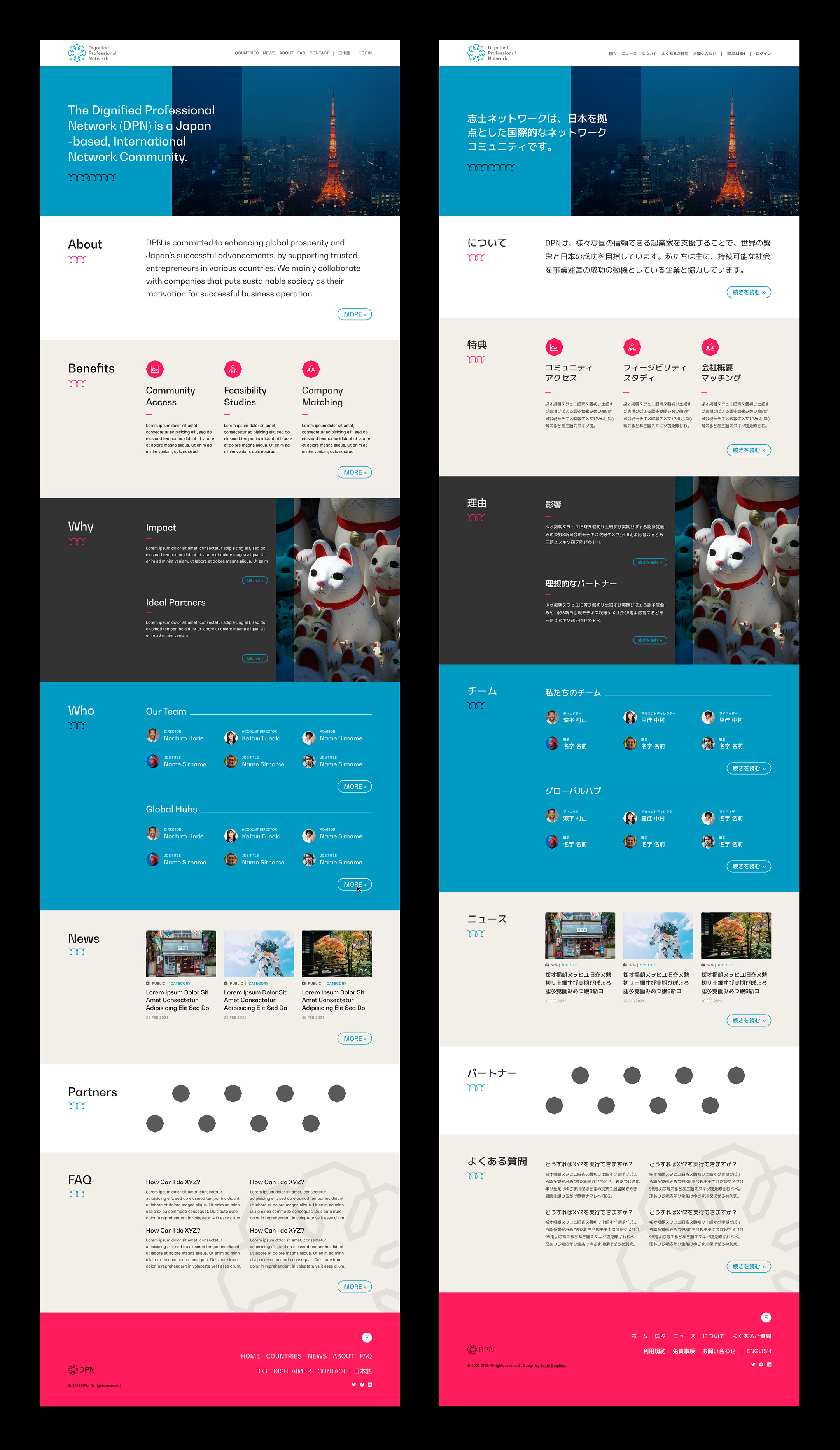
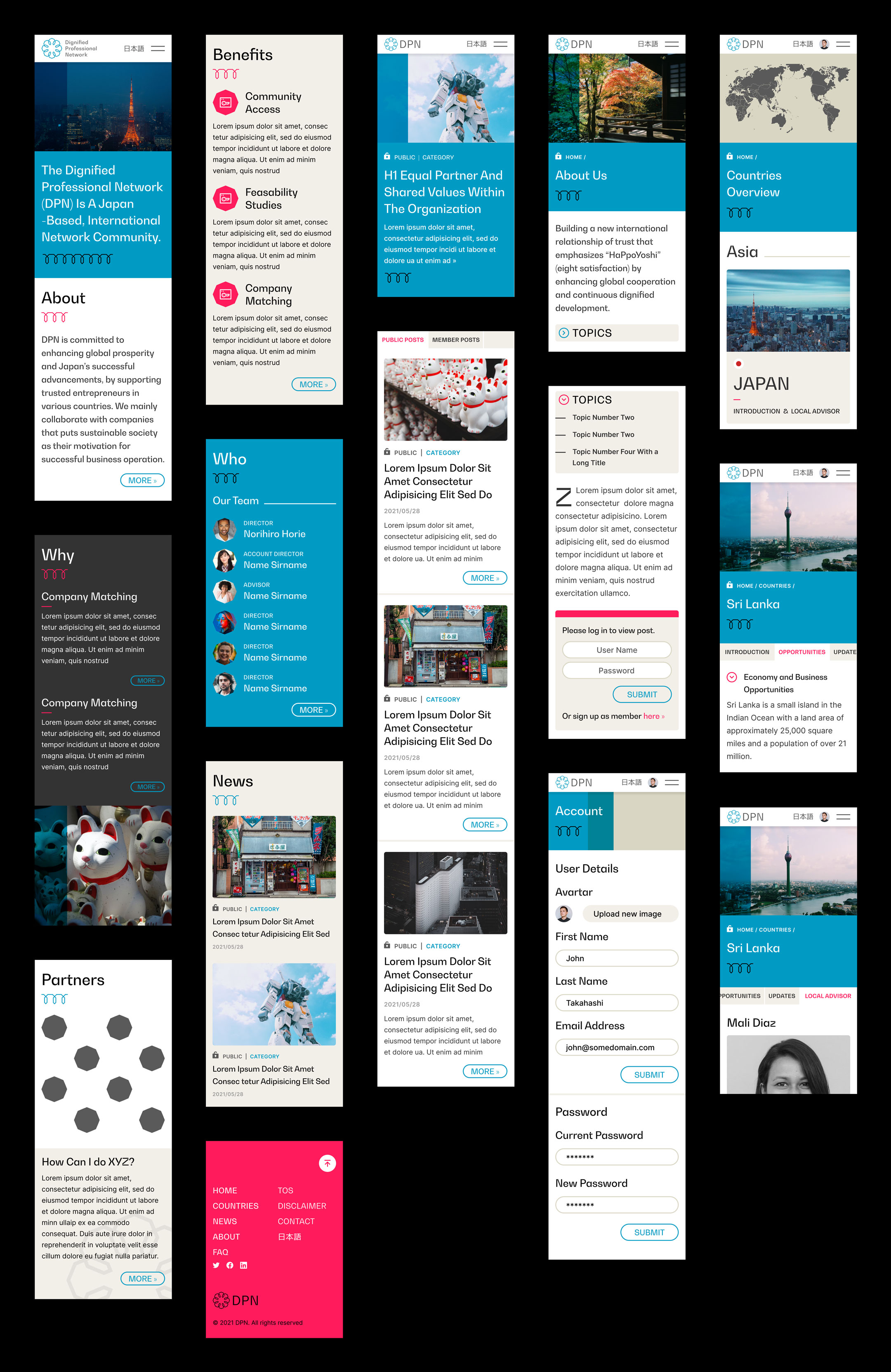
UI/UX Design
An important aspect of the bilingual English-Japanese website, apart from introducing the network, is the members only content. To this end, a subscriber lock mechanism was designed. Depending on the login state several new features become available, such as member-only articles, more in-depth stats and opportunities about each participating country, as well as contact option for a dedicated representative for each country.
Initially planning, information architecture and wireframing was carried out to define all core templates. In an second step the final interface design was applied to all templates in Desktop and Mobile screen sizes. Further several key templates were designed with Japanese typography as reference.
For this project the web development was carried out by a third-party selected by the client.