Our thoughts on the 4 short-listed Tokyo 2020 Olympic logos

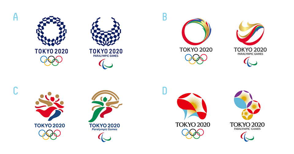
We were interviewed by The Japan Times about our thoughts on the 4 short-listed Tokyo 2020 Olympic logo candidates.
Due to the space limitations of the article we are publishing our complete thoughts here for full disclosure. Below you can find the questions by JT and our answers in full. We think it might contribute to the public debate about the 4 logo candidates which have been selected, but also about the implications of the public submission process.
Please excuse any grammatical mistakes due to the extreme time limitation we had for the answers which was less than 24 hours (we left answers mostly non-redacted for genuineness).
The full Japan Times article can be found here:
Japan’s open Olympic logo selection process wins disapproval from designers.
1.) Your general thoughts on the four final candidates.
- Focus too much on the past of Japan, like traditional paintings, Edo period etc. Ignores the rich contemporary culture and design which exists in Tokyo (Japan) today.
- While some of the justifications (concepts) of the drafts make sense, the result doesn’t “feel” Japanese: Number A evokes “Greece” flag colours for us, number B visually screams “China” (or dragon), while C is downright clumsy.
- The only visually acceptable draft is D: slight connotation of fireworks (Hanabi), hand fan and flowers, however the design feels a little old-fashion (70’s wallpaper design?)
- Nothing stands out at first sight.
- Needs more iterations to get to more meaningful and visually pleasing results.
- Most results do not immediately visually explain their concept.
- Quality seems much lower than Kenjiro Sano’s or Kenya Hara’s designs [of the initial closed contest].
2.) What is your thought regarding the “public submission” style of the contest.
- It’s exploitation of designers (and the general public’s) time and effort, since only one draft can win.
- Devalues the trade of a designer by placing everyone on the level of a designer. Degrades professional designers who studied the subject and have work experience with logo and identity design.
- Public submission with a reward of 1 mill yen (approx. $8000) is a pittance, considering what would be paid to a design agency and also how many billions of Yen will be generated through sponsorship deals on the back of this logo.
- Public submission may increase the amount of half-hearted submissions by professional designers but also general public, since nothing really is “at stake”.
- The submission guideline listed too many “key concepts” (7), hard to focus or pack all of these into one design.
- Iteration and logo development process does not exist in a one-shot “public submission”. One can hardly expect a designer or less the general public to “get it right” at the first shot. The vital creative development, collaboration and iteration part is removed and shortened to a cookiecutter template.
- Public submission seems more “fair” than a designer or agency picked by an elite, but the overall result will probably lack quality.
3.) Your thoughts on how the Olympic Emblem should be.
- The Olympic emblem should reflect the contemporary culture and design sensibility of Tokyo and Japan. It should not look to the past too much.
- It should evoke an immediate feeling of the place/culture of the hosting country.
- The logo needs to be developed rather as a flexible identity system. The actual logo is just one part of this visual design system. Other graphic design elements should be considered to make up a holistic identity to support the design in all kinds of online and offline media.
- Good examples of holistic Olympics designs are the 1968 Mexico Olympics or 1972 Munich Olympics.
- A real collaboration of designers with the Olympics committee is needed. Good design involves a process, not a one-off logo designed in insularity.
4.) Any advice to the Olympic Emblem Committee.
- Regrettably only superstar designers or all of the general public was considered. There is a huge amount of talented Japanese designers between those two extremes who should have a way to enter the competition with equal chance.
- All designers invited should be paid a fair wage to put time and effort into a competition, even if they may not succeed in the end.
- Contest should not be open to public: Too much amateur hour, too much work to review, probably resulting in review-fatigue. Most likely too many people for review needed (15k entries!). If reviewers are good and have experience in design usually they come at a cost. With potentially unlimited logo entries this review system does not seem maintainable.
- Instead the committee should work more closely with a select [small] group of young and upcoming Japanese designers.
- Not having won a certain award shouldn’t be considered a criteria to take part [like in the first “closed” competition], other selection method needed.
- How about having a component where the general public can influence which designer will design the logo, however leaving the actual design work to a professional?
- In the logo contest real collaboration of the designer with key members of the committee and creative process and iteration should be possible to incorporate feedback.